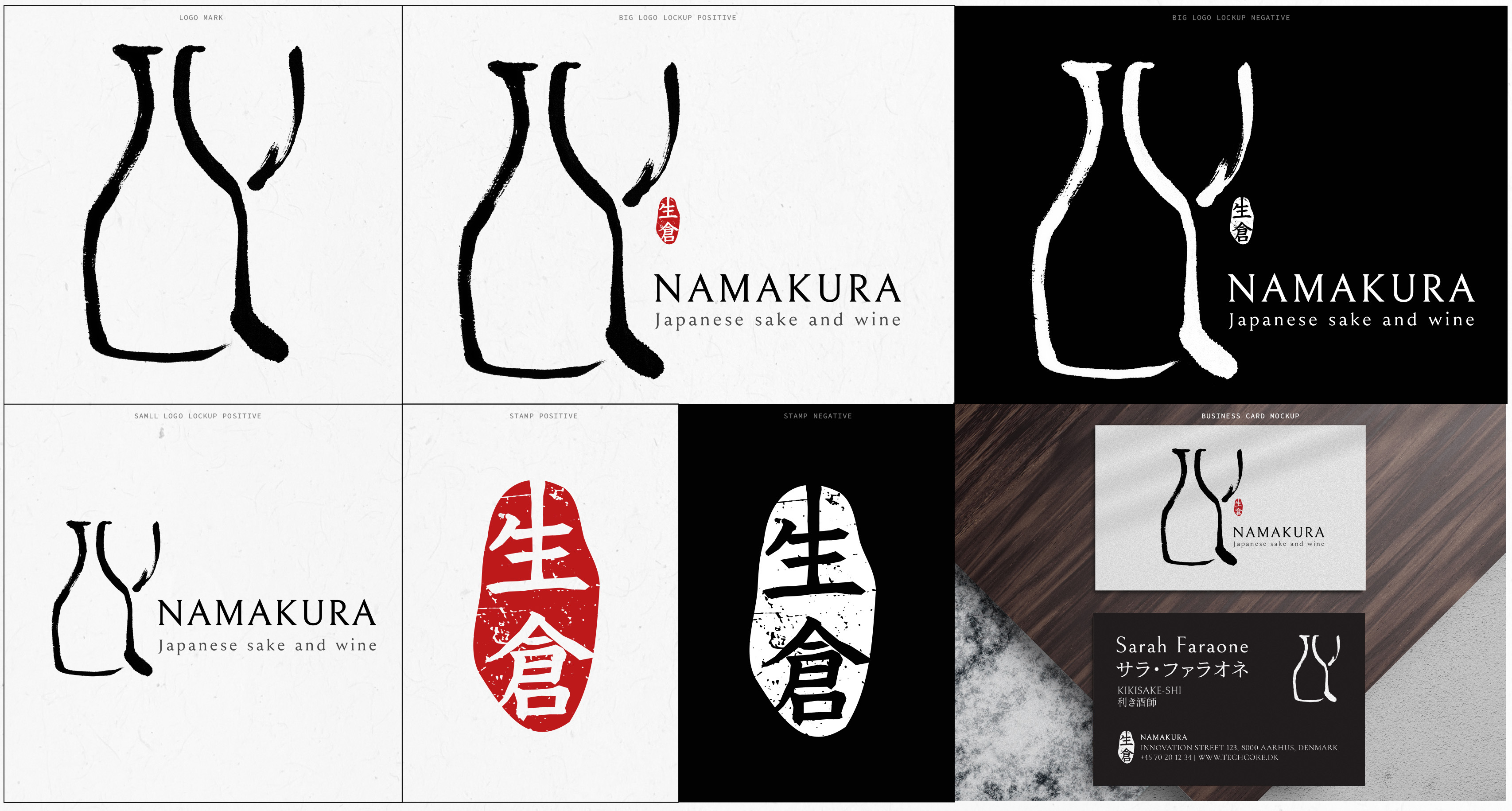
The logo for Namakura was made using traditional Chinese ink and a Japanese calligraphy brush, giving it the organic, expressive feel of a Kanji character. It consists of three strokes—each representing one element: sake, a glass, and Namakura’s own customized Kanji. .

Drawing on my experience with shūji (Japanese calligraphy) and sumi-e (ink painting) from my time living in Japan, I dove deep into the symbolism of sake together with the founders of Namakura.
Through our conversations about wine and sake, I developed the Namakura Mark: a simplified, custom Kanji composed of three strokes—symbolizing a sake bottle, a wine glass, and Namakura itself.